Apoheld
01 What is Apoheld?
Apoheld didn't want to be just another pharmacy promising the fastest delivery or the lowest prices on the market. They wanted to walk away from those clichés and step into something new they could truly own: a pharmacy that makes people feel taken care of, so they can properly take care of themselves and the people they love. That was the primary vision.
Tobias, Apoheld's owner, reached out in early May looking for a new visual identity for his digital pharmacy, which was still in the early stages of development. Pharmacy is a tough category to design for because it's so hard to break free from the usual suspects: crosses, pills, mortar and pestles, the Rx symbol, and the list goes on and on. But the second I hopped on a call with Tobias and he walked me through the idea behind the name (apo = pharmacy, held = hero), I instantly knew that holding onto the hero idea would make it easy as pie for Apoheld to steer clear of the stereotypical Rx's and crosses. I just had to figure out how. (Obviously.)
02 Competitive Landscape
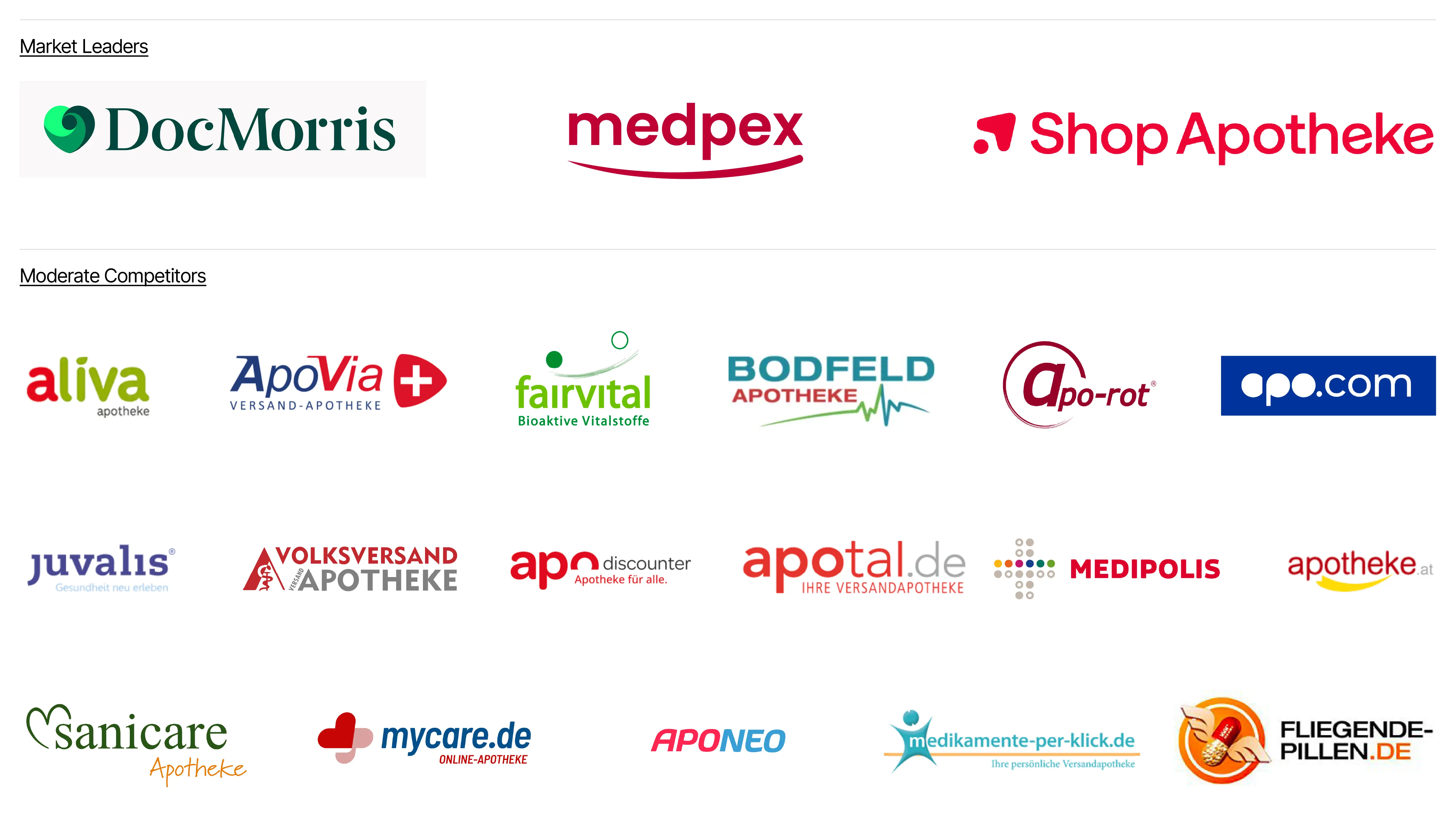
Before I started playing with the hero idea, I needed to understand the pharmacy landscape in Germany. I researched the market leaders as well as the lower-tier competitors to get a well-rounded look at the kinds of identities Apoheld would be up against in the digital space.
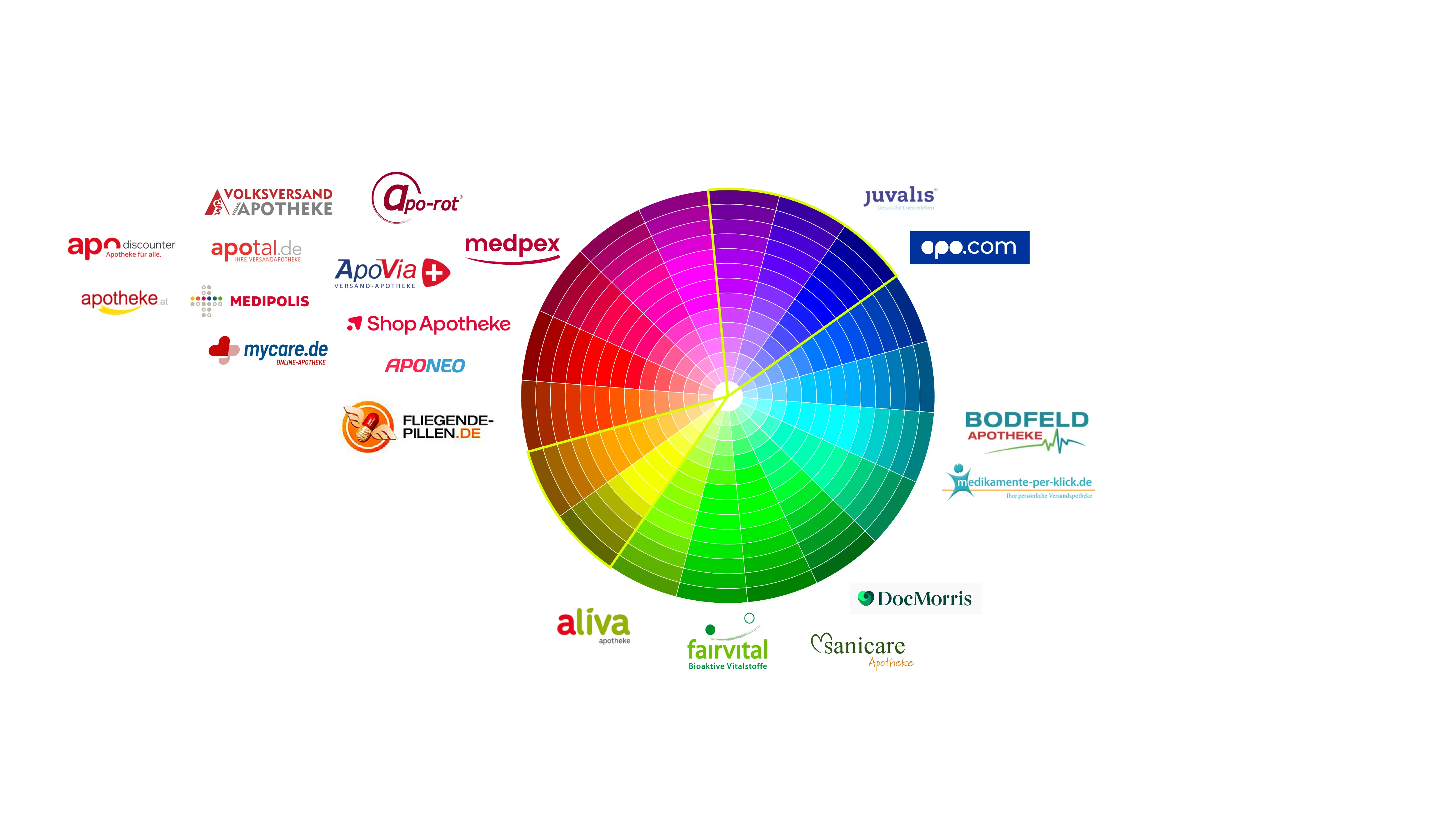
To my surprise, about 70% of the companies in the category used red, a few used green, and roughly 10–15% went with blue. Surprise number two: almost none of them had a distinct logomark of their own, apart from the market leaders and a few smaller competitors like Aporot, MyCare, and Fliegende-Pillen. So if Apoheld was going to become a market leader, it most definitely needed one.
03 Ideation
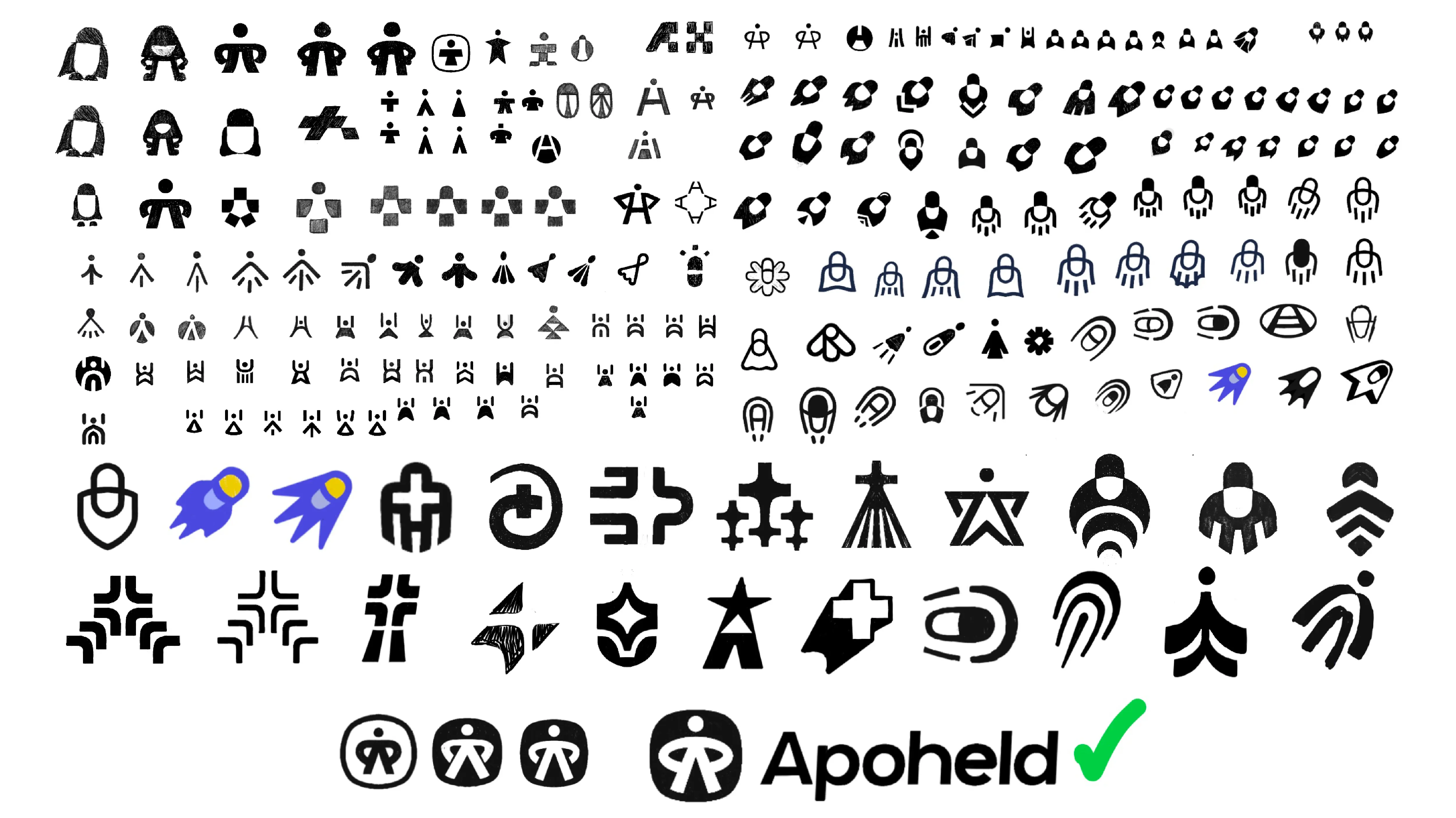
The generic symbols were obviously a no-go. It didn't take long to figure out that the logomark should come straight from the name and the purpose of the business, which is to "give people back time and headspace when everyday health asks too much." On top of that, a hero takes the hard stuff off your plate so you don't have to worry about it.
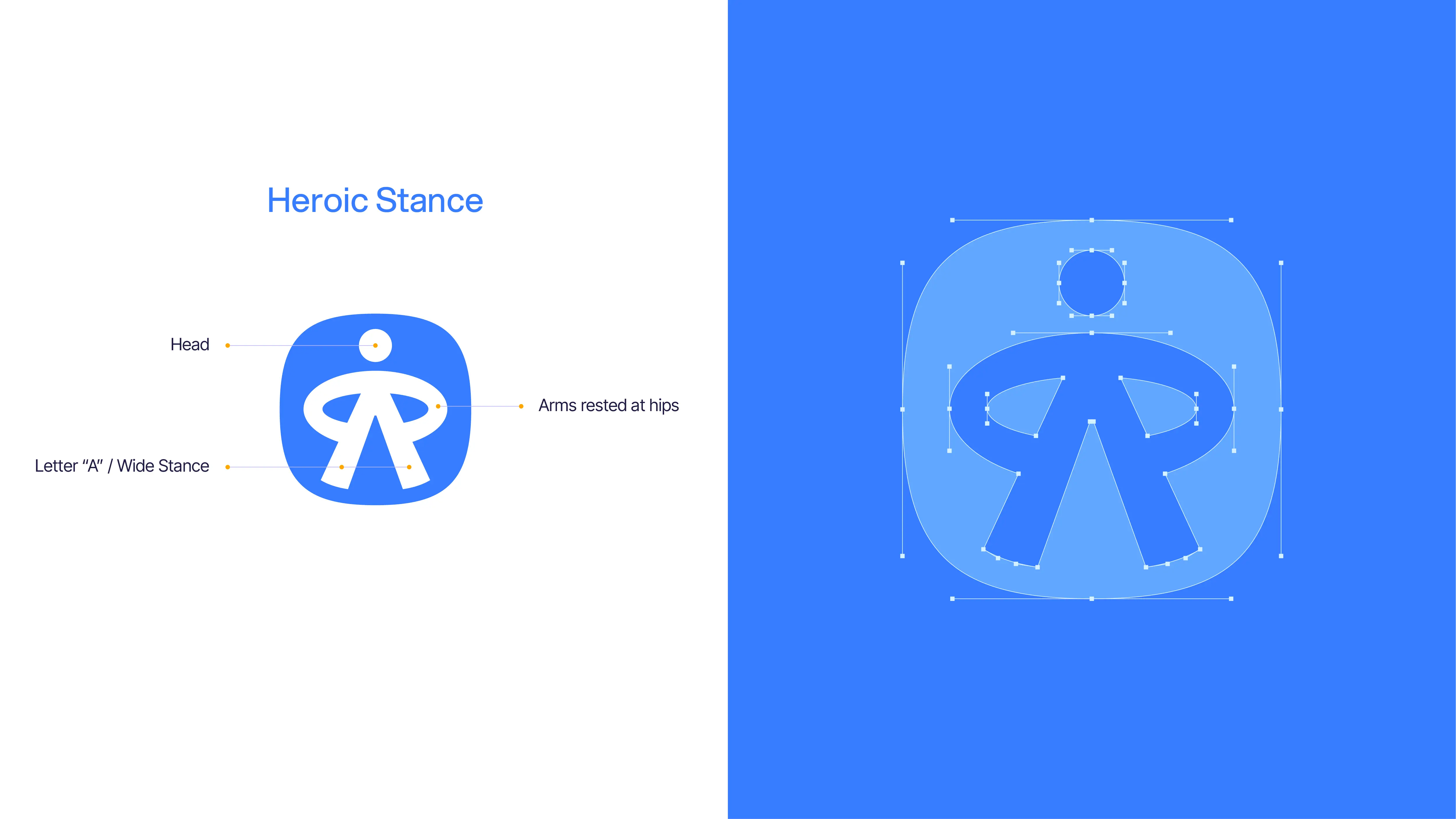
I explored a ton of options. Some cliché, some fun, some a little too fun. About 100 concepts later, I landed on the one at the bottom of the page below: a human figure striking a hero pose. Head at the top, arms bent with hands resting on the hips, and a wide stance that forms an "A" for Apoheld. Protective posture, strong base, welcoming geometry. Everything Apoheld was trying to portray, all in one mark.
PS: Isn't it funny how my very first ideas (top right) were basically the same as the final product? Guess all those sketches in between weren't necessary, haha... (nervous laugh). Just kidding. They totally were.
04 Wordmark
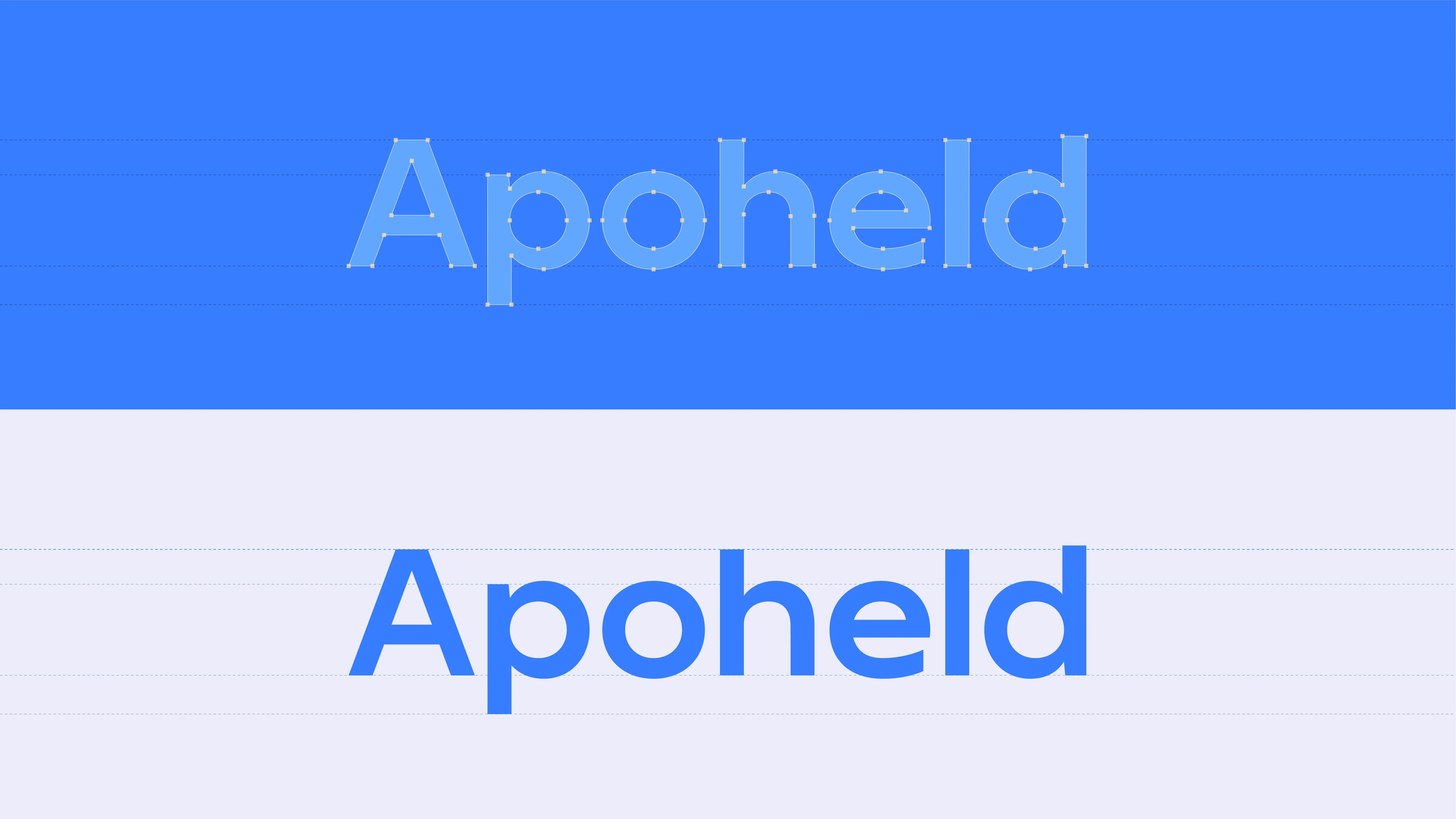
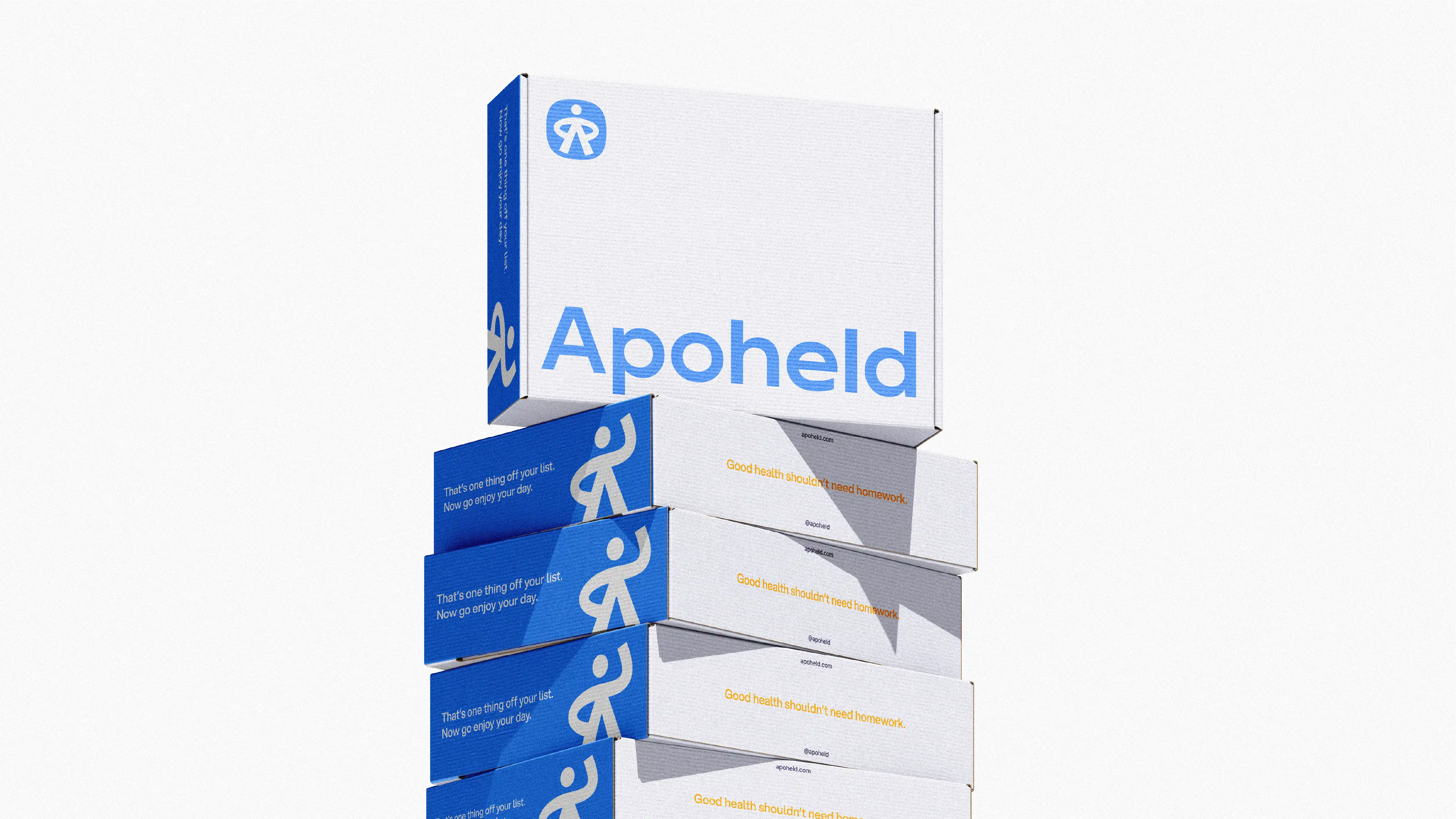
Once the hero was figured out, it needed a name to stand beside it. Apoheld's wordmark was designed from scratch, and even though it might not look like it, that was sort of the point. I wanted it to feel quiet, calm, and strong all at once, without going overboard on letter customization. To follow suit with the squircle-shaped logomark, I used wider letterforms that echo its shape, so the wordmark feels geometric without being too perfect (read: boring).
Most of the letters are fairly standard, but the one that really makes this wordmark is the "e." The little bowl at the bottom gives it just the right amount of friendliness while keeping things professional. It almost looks like a little smile, which feels fitting.

05 Injecting Life Into the Logo
The primary logomark looked great, but I kept asking myself: how the heck can I make this better and breathe some life into it? It's a human, after all, so it should be able to move around.
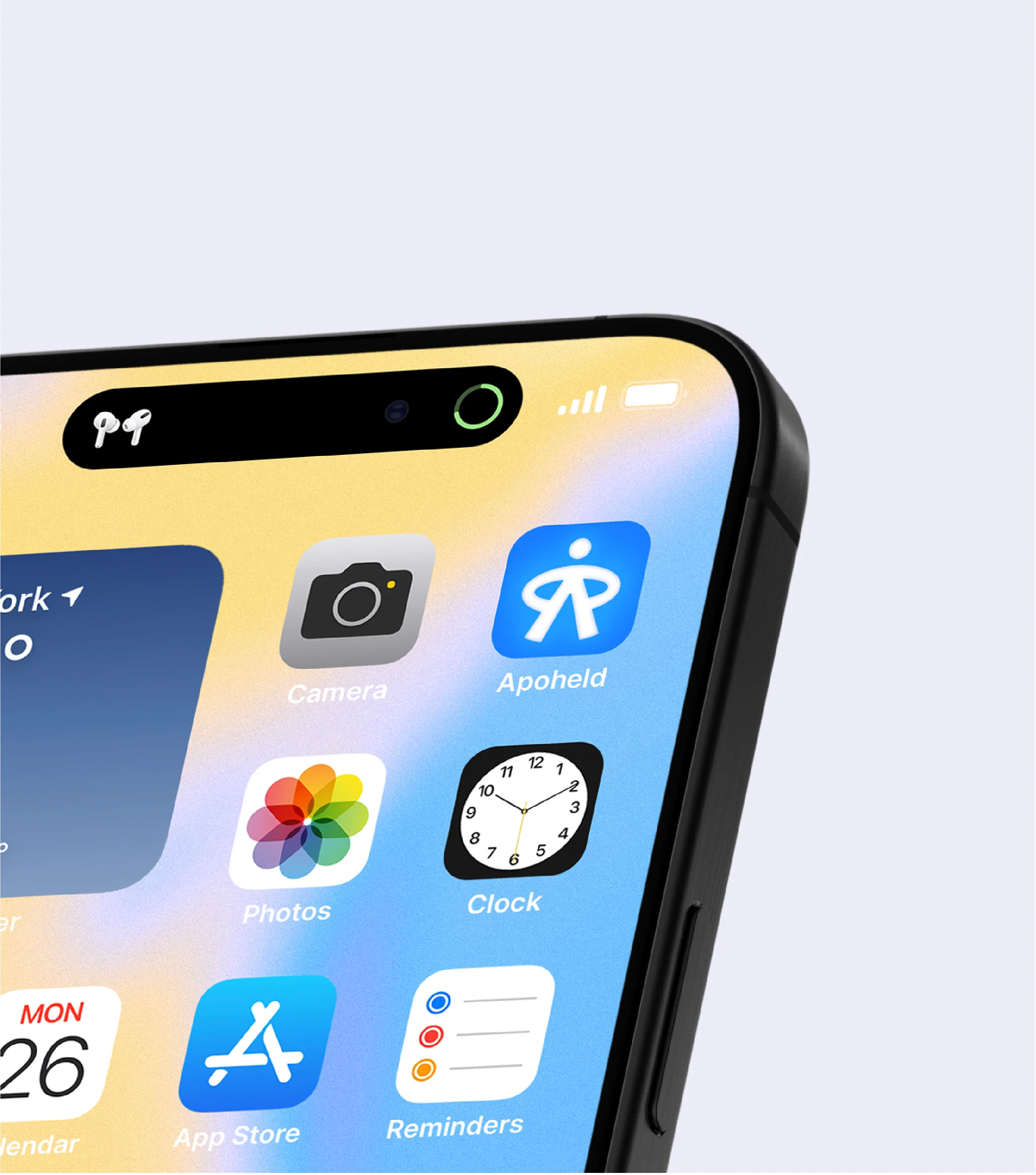
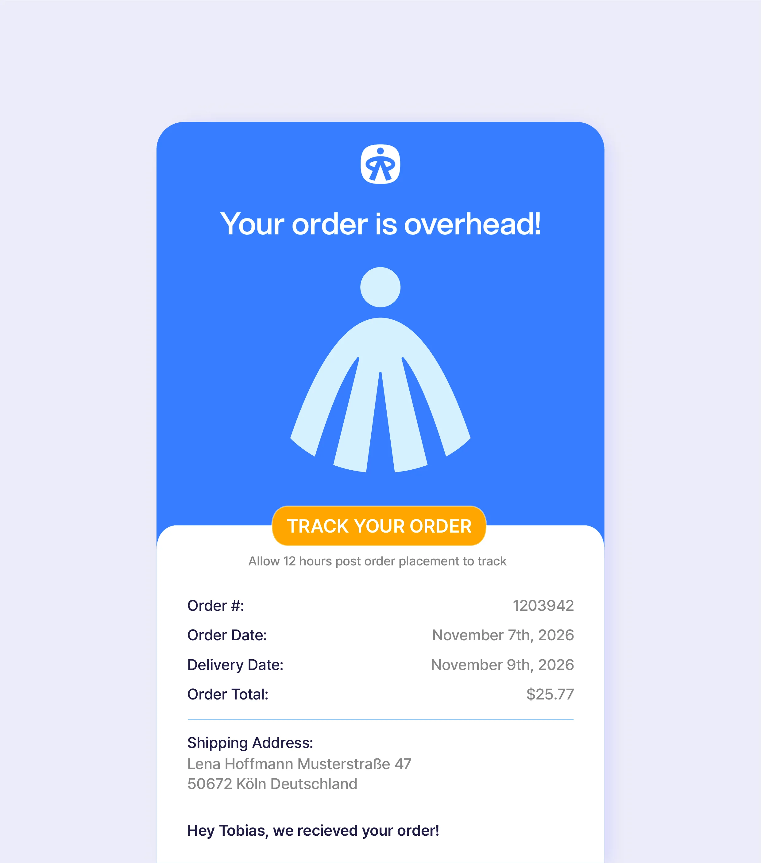
So I ran with that and made a couple of variations that gave the character more dimension. Instead of a geometric corporate logo that falls flat, people get a genuine way to connect with the brand. The hand wave does this perfectly. It works as a great asset across the brand to show that Apoheld is here to help and protect, and it also helps customers understand what the mark actually is (a friendly little hero, here to help out with your health).


06 The Identity
With the hero and the wordmark settled, the rest of the identity had one job: back them up. Every hero needs a solid support crew.
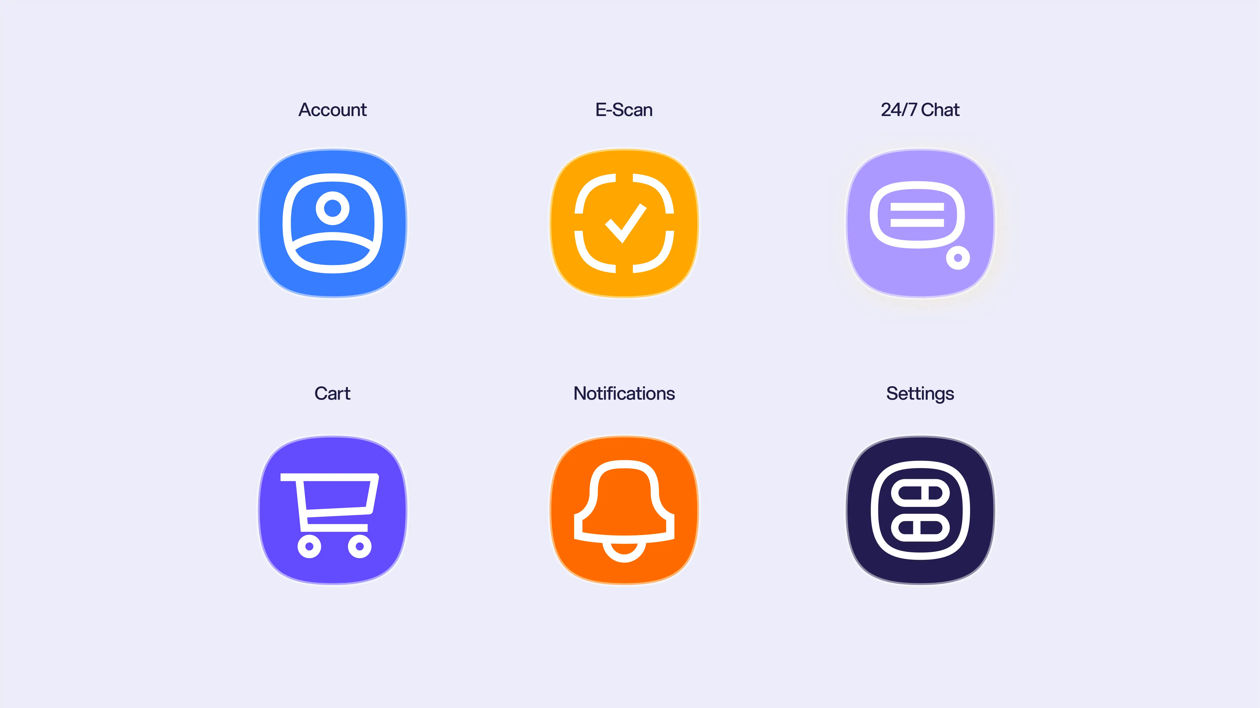
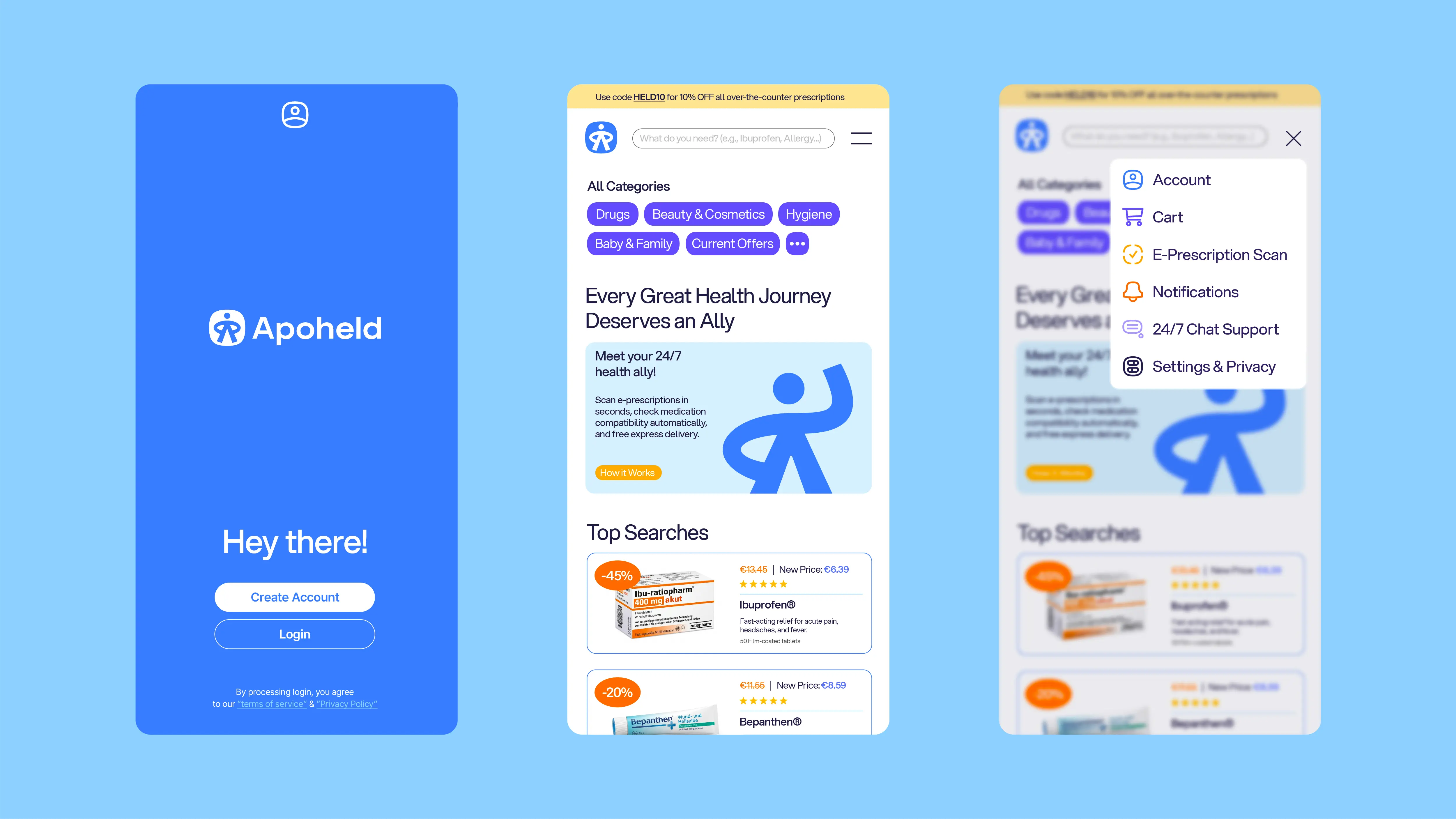
The icons borrow their geometry straight from the logomark. They share its squircle shape, rounded corners, and chunky strokes, so everything from the cart to the e-prescription scanner feels like part of the same family.
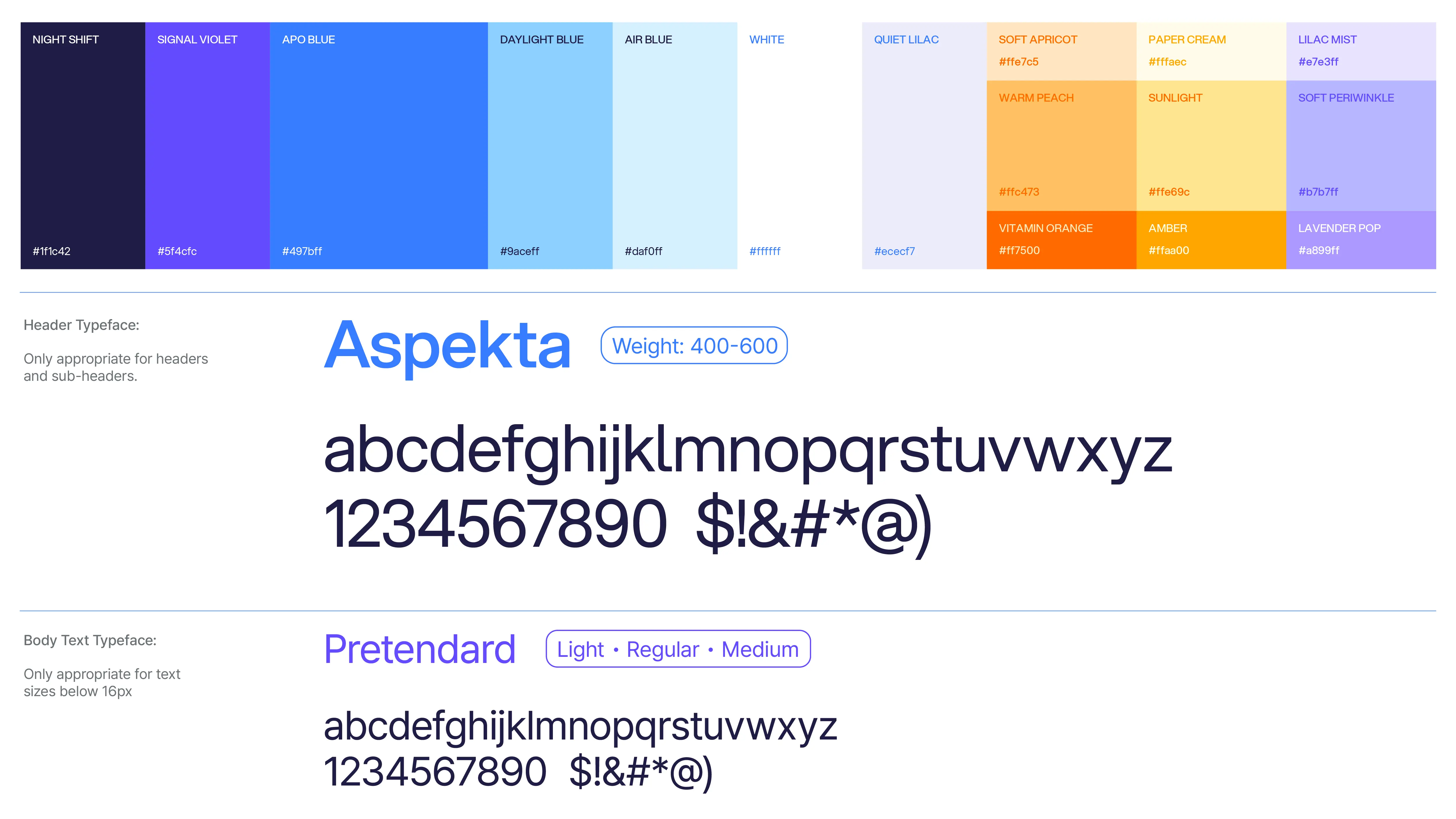
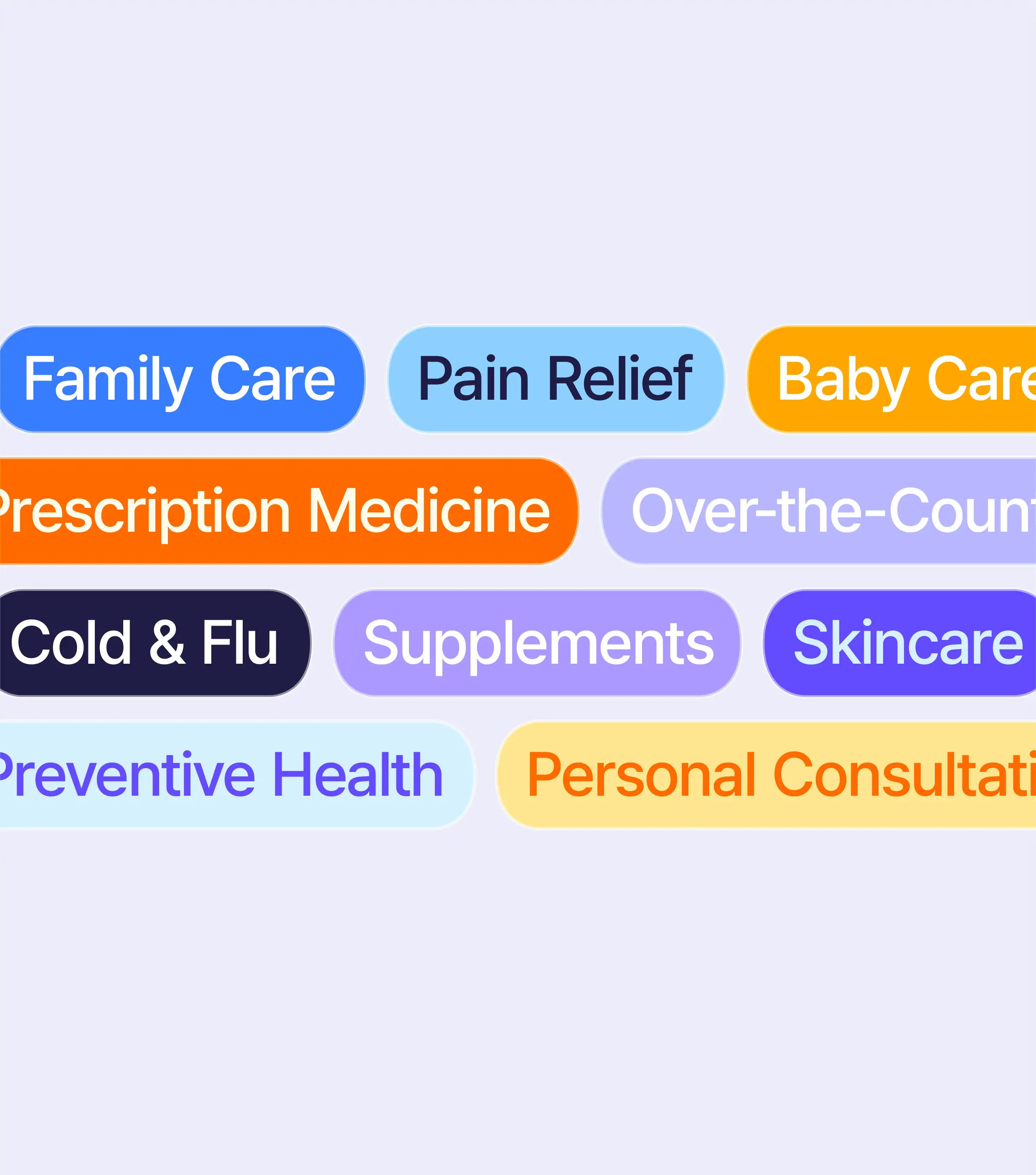
Apo Blue leads the palette due to the large blue gap on the color wheel with blueish purples backing it up. The secondary colors are where things get lively. Vitamin Orange, Amber, Sunlight, and Warm Peach bring a burst of warmth and energy, steering the whole brand far from the boring, clinical look the category is known for. (Leading with blue in a category that's 70% red doesn't hurt either.)
The typography is clean and simple on purpose. Aspekta handles the headers, and Pretendard takes care of the body copy. Neither tries too hard to be playful, because the logo and its variations already do the heavy lifting there. The type just keeps everything clear and easy to read. With all this being said, now you get a pharmacy that feels less like a waiting room and more like a friend who happens to know a lot about ibuprofen :)


07 Wrapping Up
The goal from the start was to build a pharmacy brand that makes people feel taken care of, without leaning on a single cross or pill. Instead, Apoheld got a hero. One that stands guard in the logo, waves hello across the app, and takes a little weight off people's shoulders every time they need it.
Apoheld is gearing up for launch and I can't wait to see this little hero out in the world. Huge thanks to Tobias for trusting me with it.