Mere Mortals
01 Synopsis
Mere Mortals is a digital product studio that creates thoughtful, design-led software such as apps/websites for forward-thinking founders. Backed by decades of experience, they’re building a multidisciplinary team to deliver original and tailored client solutions.
02 Problem
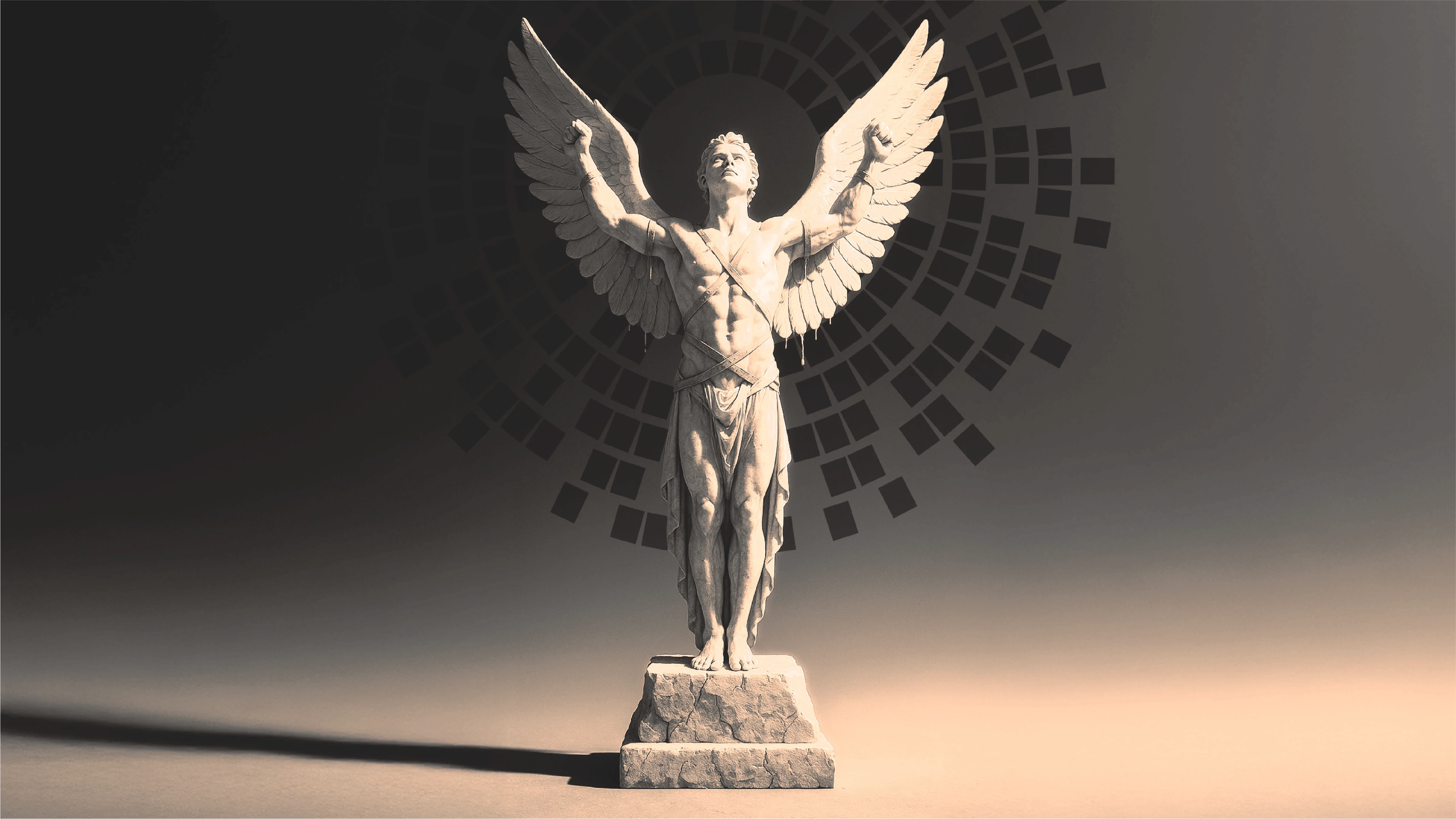
The very last thing the Mere Mortals team wanted was a generic logo that predictably blended into the tech and software space(as well as the use of basic/boring gradients!). They made it abundantly clear that Mere Mortals wasn’t just a tech company that develops software, but a brand that pioneers entirely original ideas. They needed an identity that reflected exactly that.

02 Solution
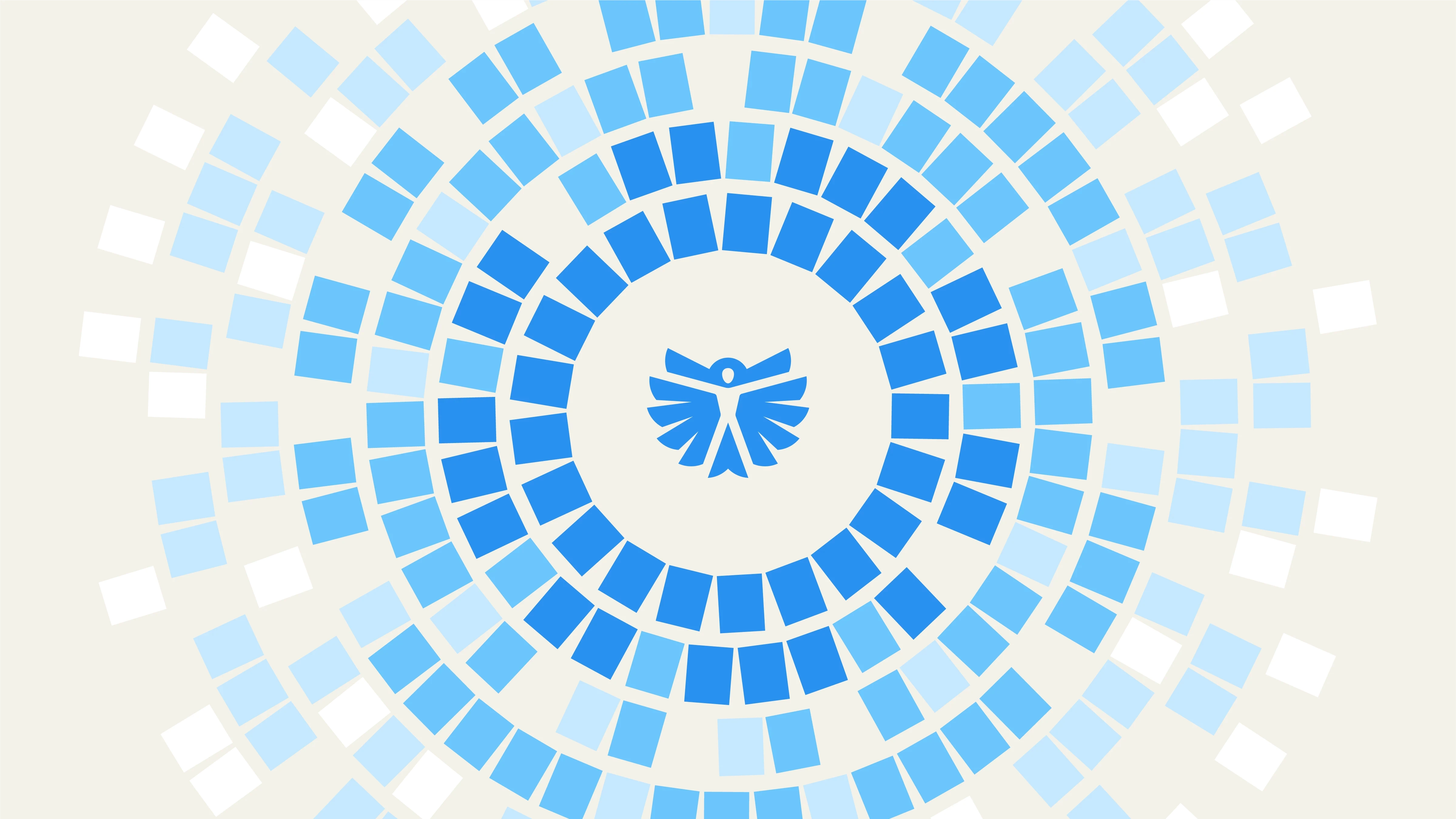
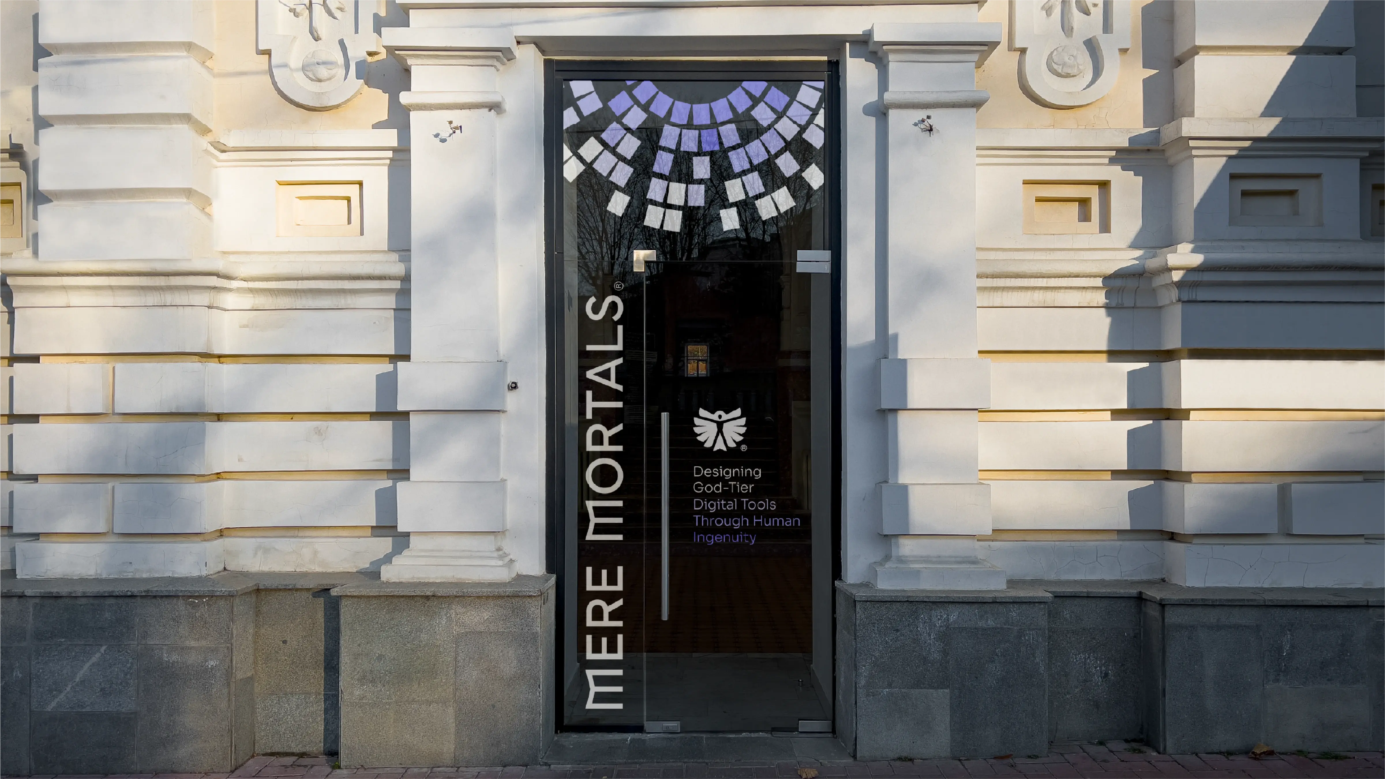
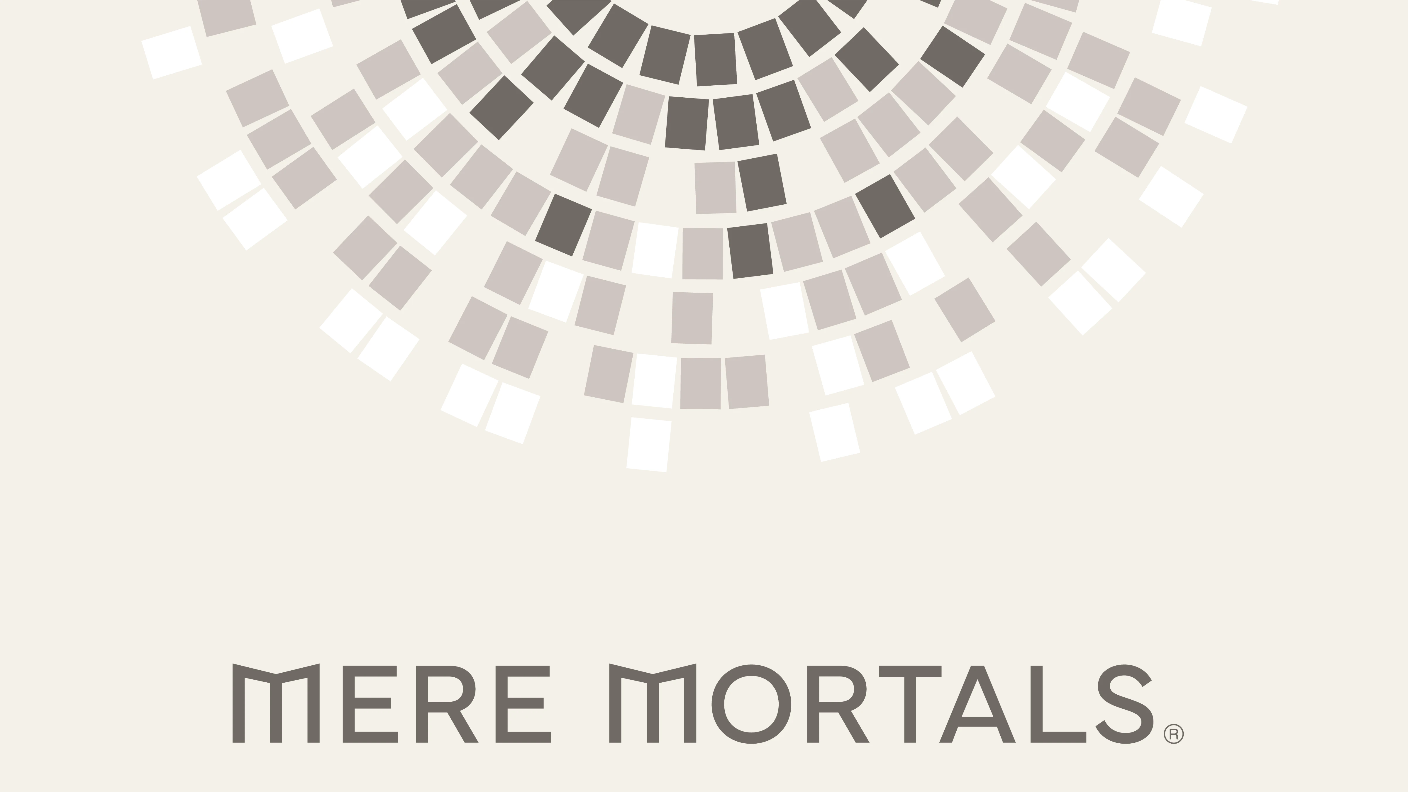
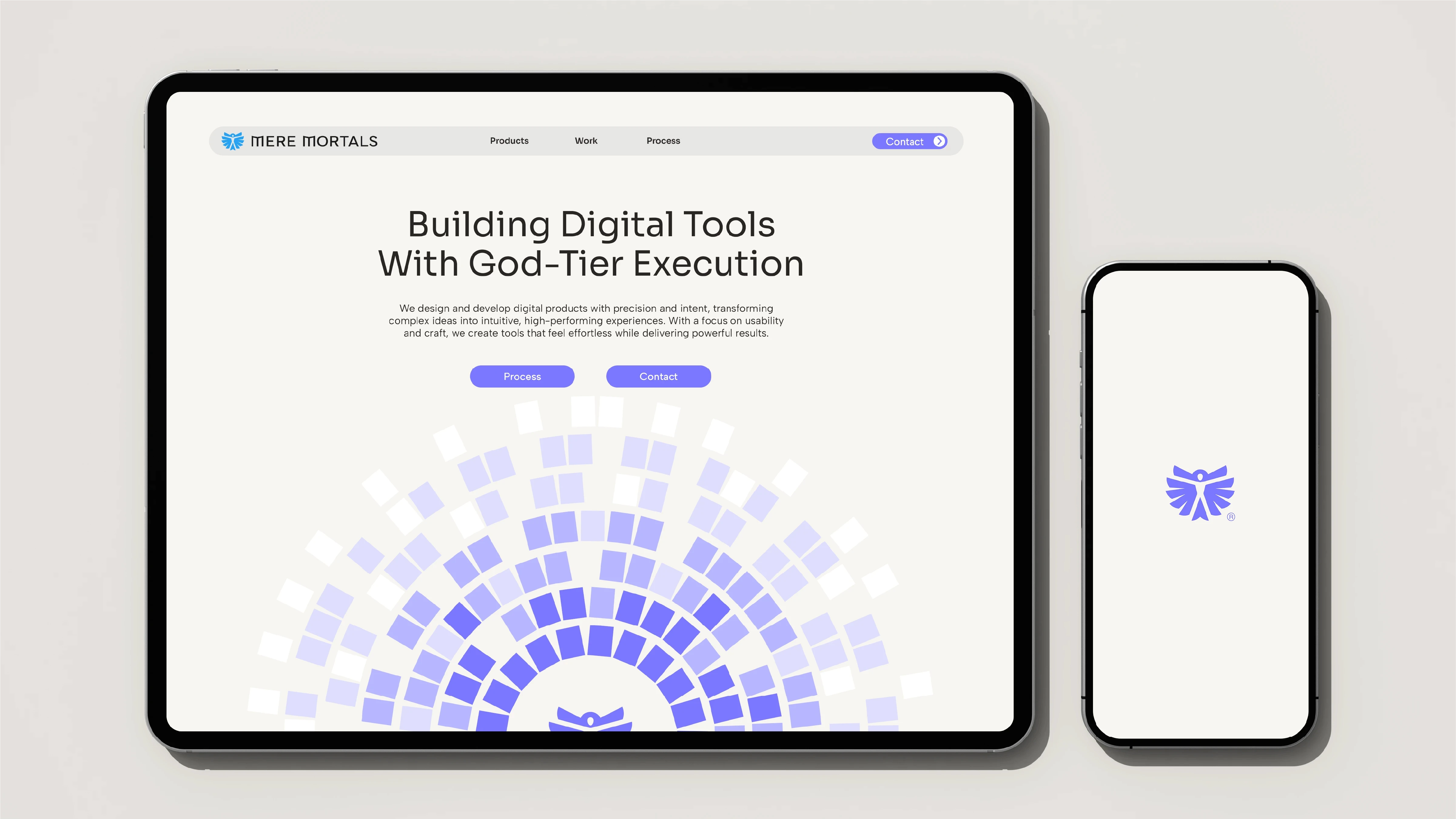
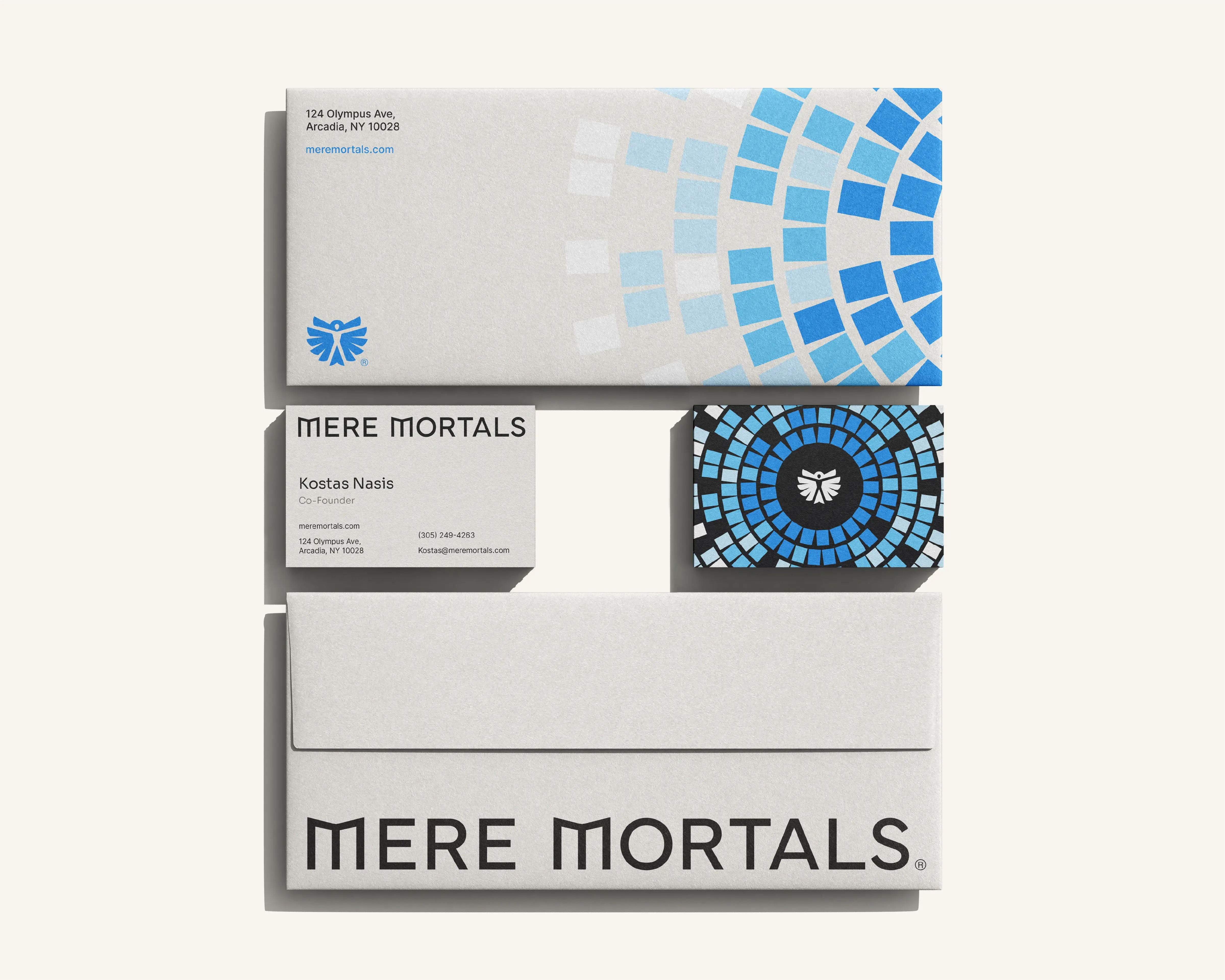
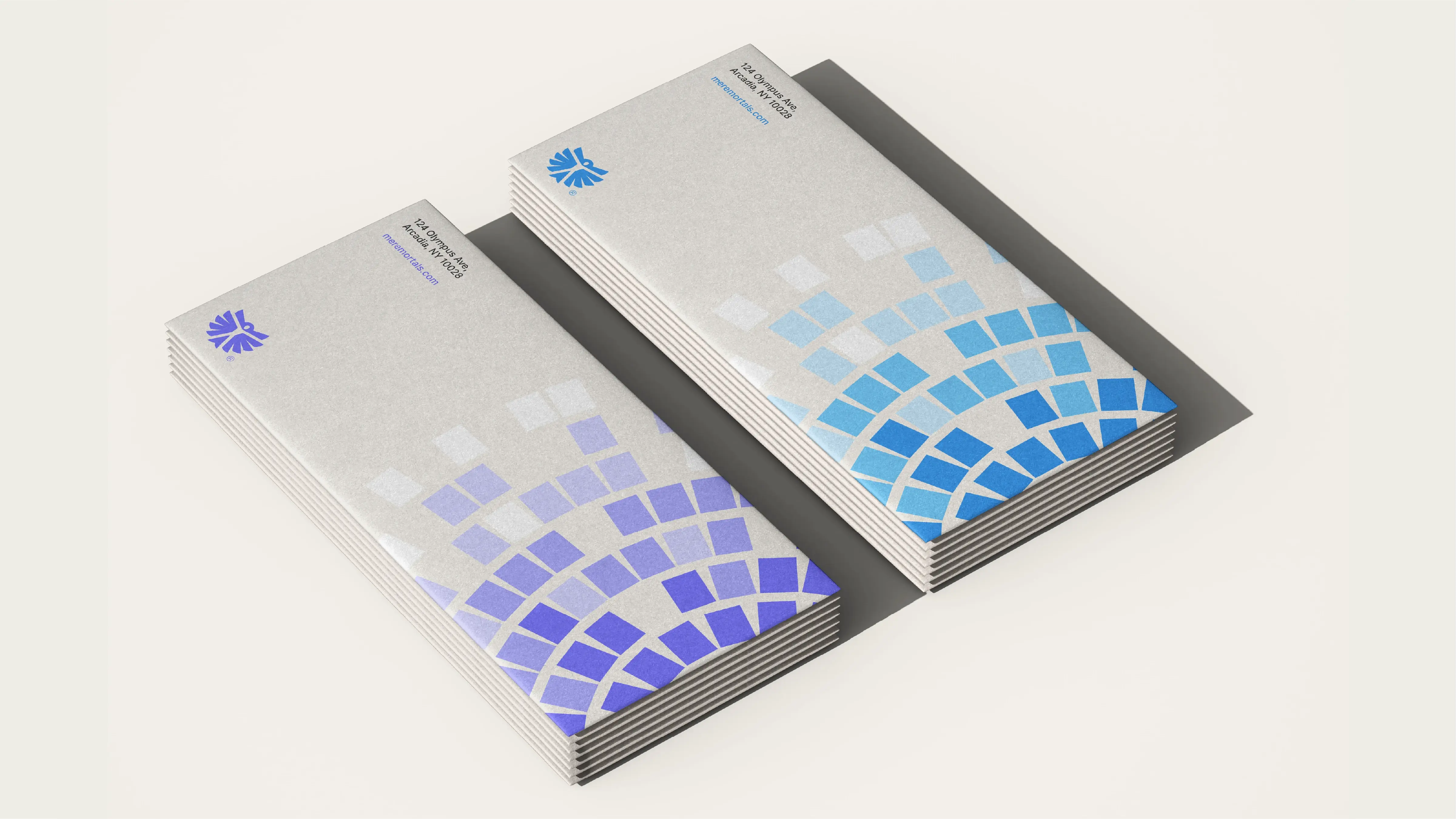
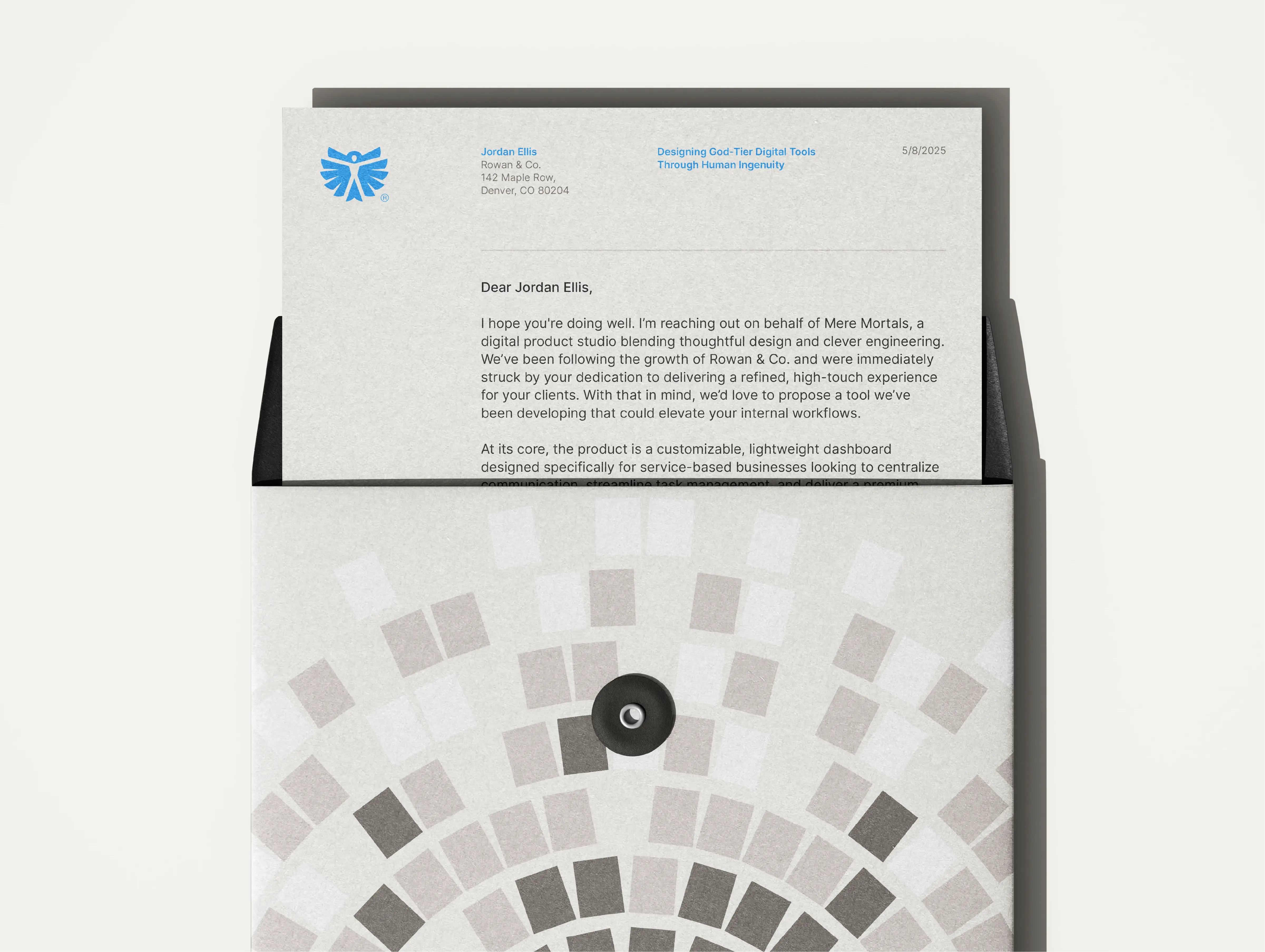
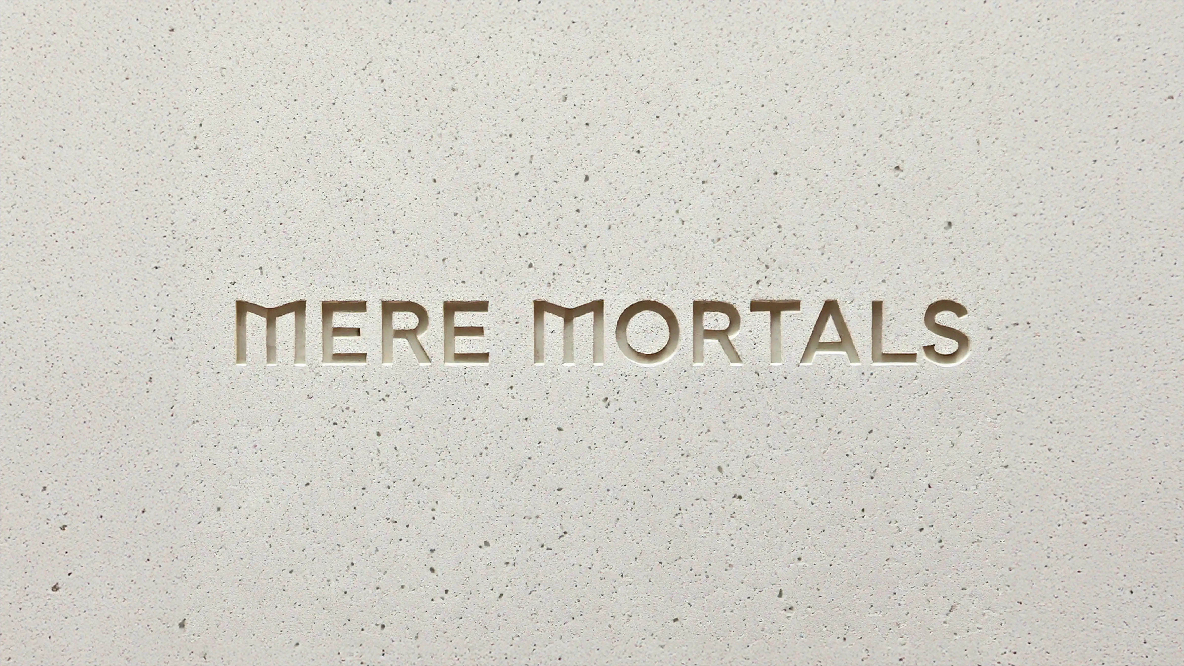
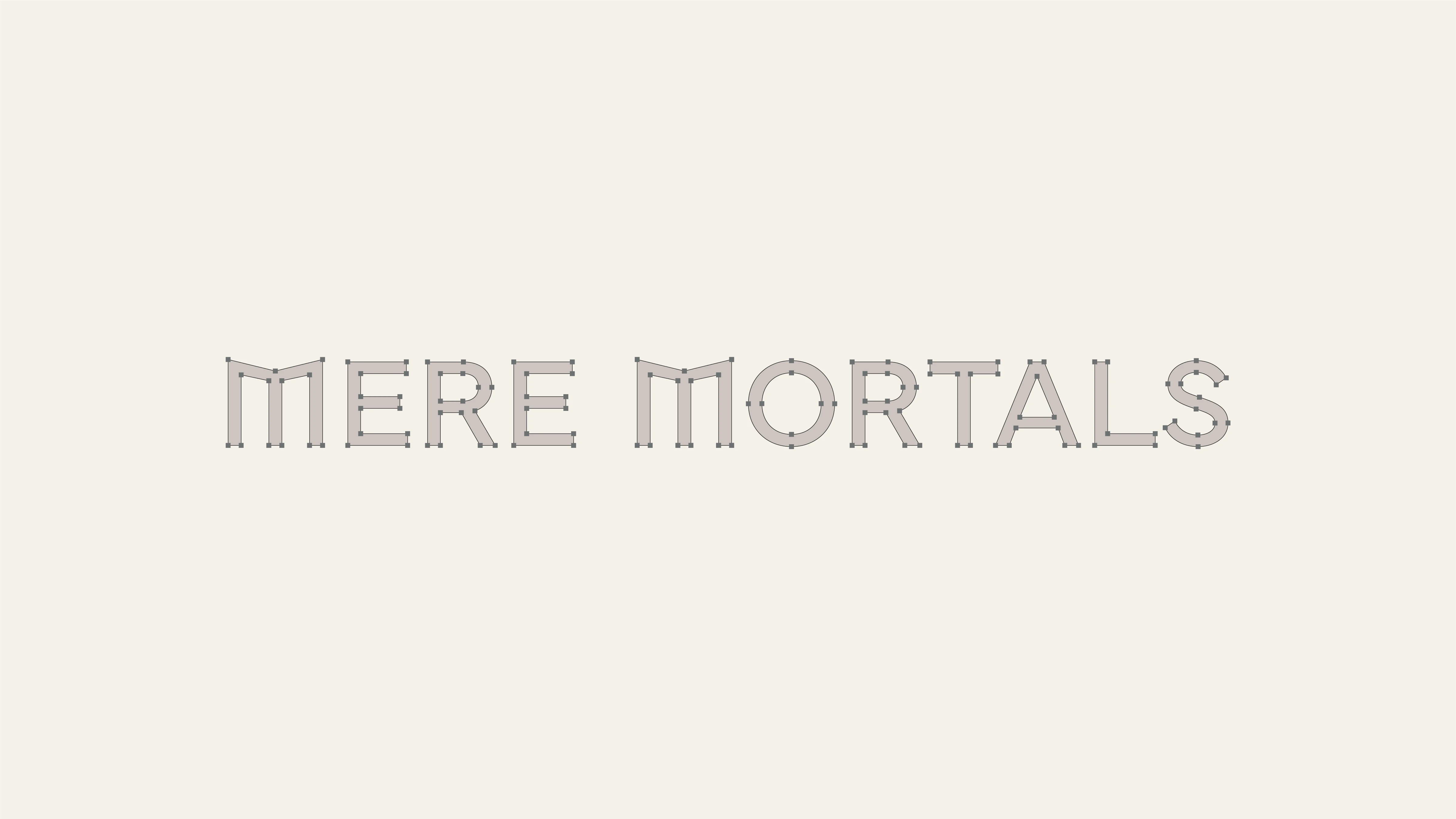
The team approached me with a foundational direction for the identity, leaning into Greek Mythology to inspire key design elements. The logomark represents the story of Icarus, a mortal who strived to reach the sun through pure innovation and determination. By merging wings and a human form carved into the negative space, the mark instantly gave Mere Mortals a distinctive signature in the space. The customized “M”s in the wordmark mimick classical column architecture, giving the typography an immediate sense of stature and strength. To move past basic gradients, we utilized radial graphics inspired by ancient Greek tiles (an art form refined and popularized by the ancient Greeks). Whether used on a wide, tall, or small canvas, the graphics are designed to create dynamic compositions in any context.